Creating a User-Friendly App for the E-Medicine Delivery APP
With MedZap, medication ordering and information access can be accomplished with ease through a few simple clicks. As the Senior UI designer, I am confident in guiding you through the design process.
Creating a User-Friendly App for the E-Medicine Delivery APP
With MedZap, medication ordering and information access can be accomplished with ease through a few simple clicks. As the Senior UI designer, I am confident in guiding you through the design process.
Creating a User-Friendly App for the E-Medicine Delivery APP
With MedZap, medication ordering and information access can be accomplished with ease through a few simple clicks. As the Senior UI designer, I am confident in guiding you through the design process.

Project Summary
This case study details the design process of the MedZap mobile app. MedZap simplifies the medication ordering process by allowing users to order medication, access information on medication, and receive instructions with just a few clicks. The app was created to provide users with a convenient platform for accessing medication-related information. As the Senior UI designer for the project, I collaborated closely with the UX designer, product manager, and development team to ensure that the final design met the app's goals and user needs. In this journey, I will take you through the entire design process, from initial research to final design, and explain my thought process and design decisions.
Target Audience
Businesses and individual customers in the pharmaceutical industry
Problem Statement
The problem that MedZap aimed to solve was the inconvenience and lack of accessibility of the traditional medication ordering process and finding related information. Our research revealed that users faced several challenges in the existing process, such as the physical need to visit a pharmacy, lack of competitive pricing, and limited access to detailed information and instructions on medication.Based on these insights, we created an app that would simplify ordering medication and provide users with a convenient platform for accessing medication-related information. To address the pain points, we conducted a thorough analysis of the existing process, user interviews, and competitive research to identify opportunities for improvement. This process helped us define the key features and functionalities of the app that would make it stand out from the competition and meet the user's needs.Our goal was to create an intuitive and visually appealing app allowing users to order medication, access information on medication, and get instructions in a few clicks. We worked closely with the UX designer, product manager, and development team to ensure the final design aligned with the app's goals and user needs.
Design Process
Improving the effectiveness of the design process.
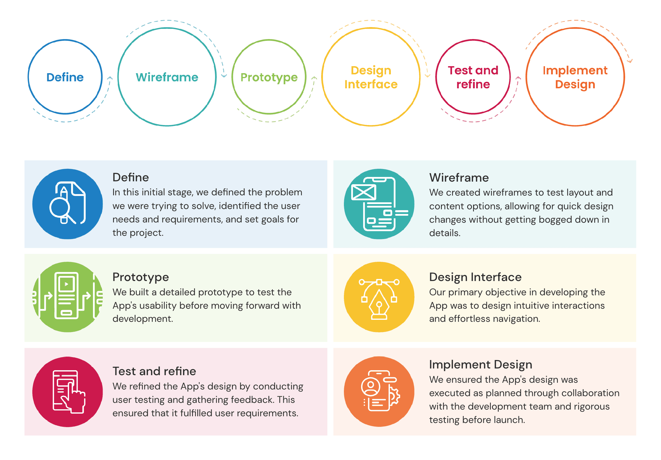
Design Decisions
Our design decisions focused on a user-centred approach, using a minimalistic design with simple colours, typography, icons, and illustrations. The app was organised logically and intuitively, making it easy for users to access and understand necessary information.

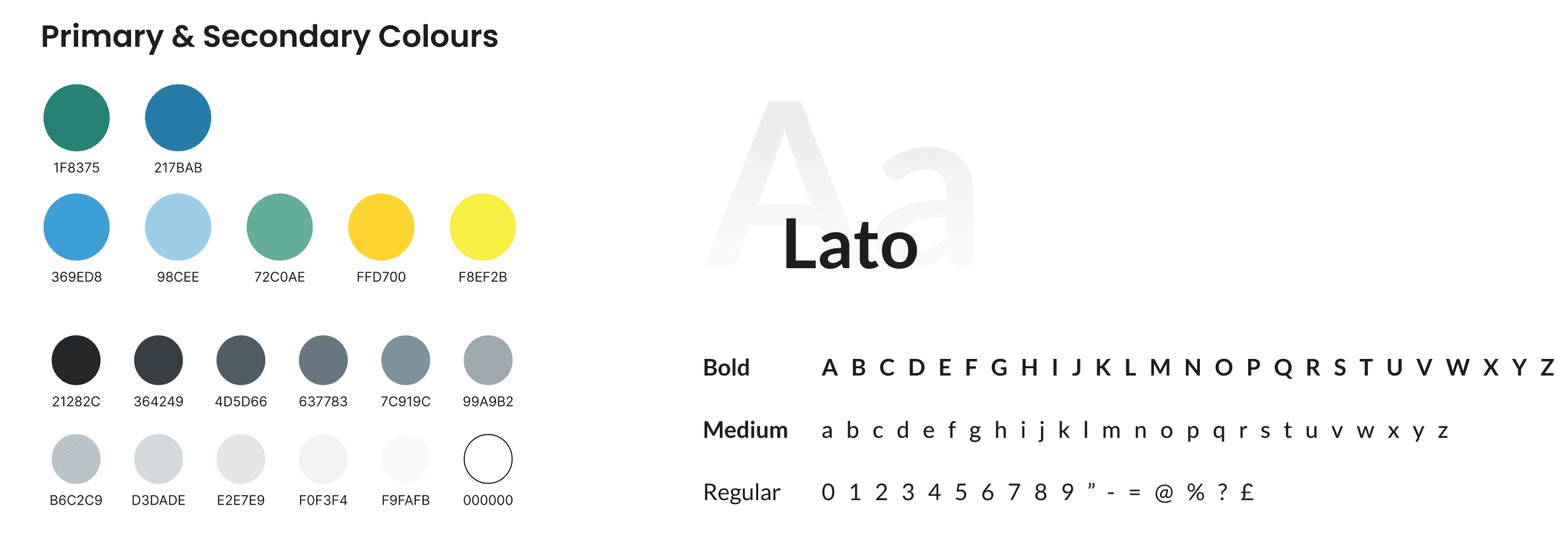
Colours & Typography
Our design decisions focused on a user-centred approach, using a minimalistic design with simple colours, typography, icons, and illustrations. The app was organised logically and intuitively, making it easy for users to access and understand necessary medical information.
Wireframe
We created wireframes for the app using both low and high-fid designs. This approach was adopted to help stakeholders visualise the App features and functionalities clearly and concisely. Also, we have used these wireframes to test the flow with users to identify usability issues and ensure the flow was logical and intuitive.

Design System

High-Fidelity Design
Once the low-fidelity wireframes were approved, I created high-fid designs using the app's brand guidelines. This involved selecting Illustration, typography, colours, and button styles aligned with the brand's visual identity. Here are some final designs.
Onboarding screen:
Users will be greeted with a welcoming splash screen when first opening the app. Following this, the app will provide a helpful series of screens containing illustrations that will guide new users through the various features and functionalities available within the app.

Authentication screen:
Authentication screen for seamless login and signup.

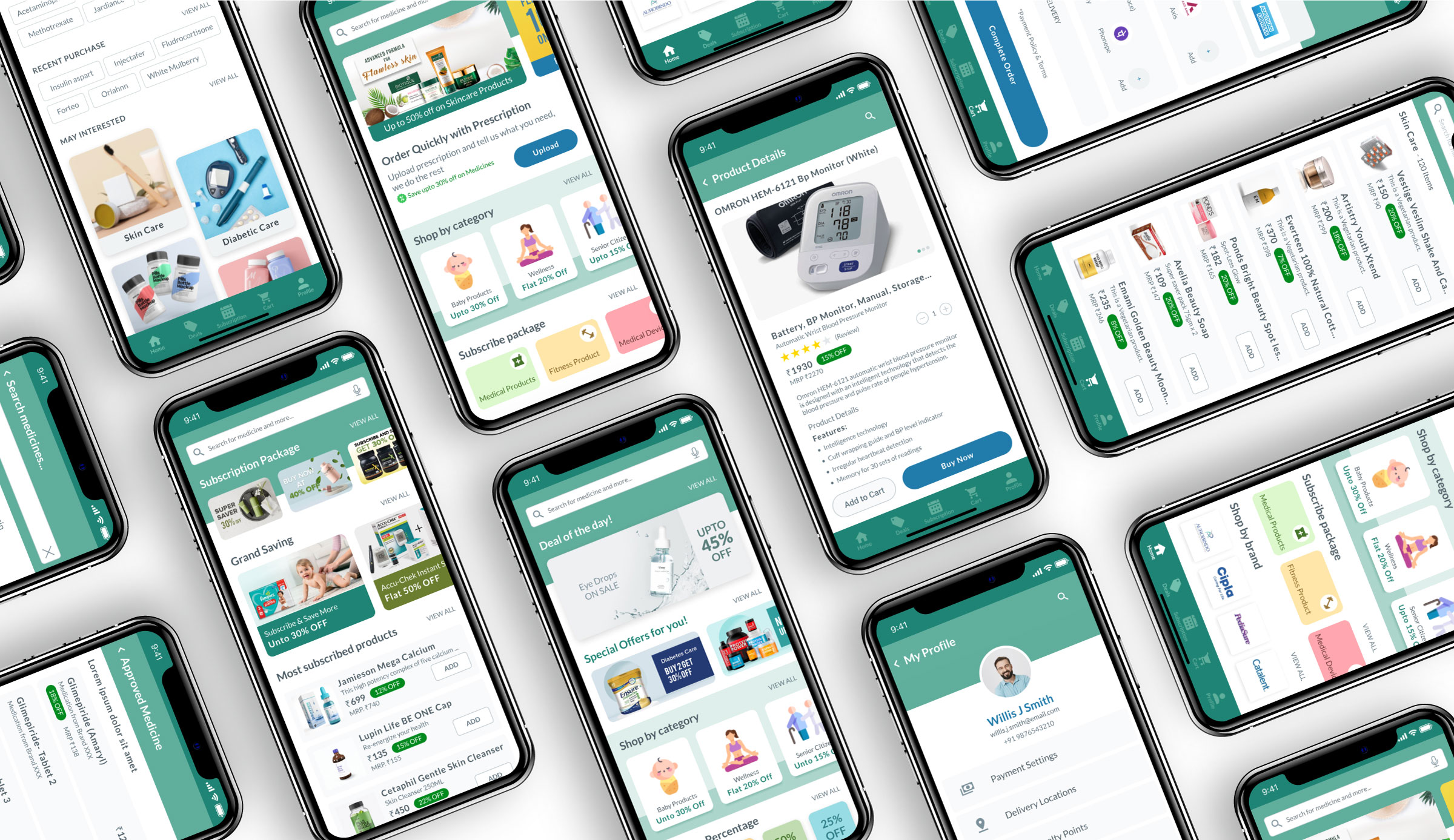
Main App’s Screen:
A look at Home Screen and Primary Navigation menu options

Streamlined Shopping:
Effortlessly find and add products to your cart with the search and preview feature.


Prescription Upload:
Effortlessly find and add products to your cart with the search and preview feature.


Design mockup:
Effortlessly find and add products to your cart with the search and preview feature.
Project Summary
This case study details the design process of the MedZap mobile app. MedZap simplifies the medication ordering process by allowing users to order medication, access information on medication, and receive instructions with just a few clicks. The app was created to provide users with a convenient platform for accessing medication-related information. As the Senior UI designer for the project, I collaborated closely with the UX designer, product manager, and development team to ensure that the final design met the app's goals and user needs. In this journey, I will take you through the entire design process, from initial research to final design, and explain my thought process and design decisions.
Target Audience
Businesses and individual customers in the pharmaceutical industry
Problem Statement
The problem that MedZap aimed to solve was the inconvenience and lack of accessibility of the traditional medication ordering process and finding related information. Our research revealed that users faced several challenges in the existing process, such as the physical need to visit a pharmacy, lack of competitive pricing, and limited access to detailed information and instructions on medication.Based on these insights, we created an app that would simplify ordering medication and provide users with a convenient platform for accessing medication-related information. To address the pain points, we conducted a thorough analysis of the existing process, user interviews, and competitive research to identify opportunities for improvement. This process helped us define the key features and functionalities of the app that would make it stand out from the competition and meet the user's needs.Our goal was to create an intuitive and visually appealing app allowing users to order medication, access information on medication, and get instructions in a few clicks. We worked closely with the UX designer, product manager, and development team to ensure the final design aligned with the app's goals and user needs.
Design Process
Improving the effectiveness of the design process.
Design Decisions
Our design decisions focused on a user-centred approach, using a minimalistic design with simple colours, typography, icons, and illustrations. The app was organised logically and intuitively, making it easy for users to access and understand necessary information.
Colours & Typography
Our design decisions focused on a user-centred approach, using a minimalistic design with simple colours, typography, icons, and illustrations. The app was organised logically and intuitively, making it easy for users to access and understand necessary medical information.
Wireframe
We created wireframes for the app using both low and high-fid designs. This approach was adopted to help stakeholders visualise the App features and functionalities clearly and concisely. Also, we have used these wireframes to test the flow with users to identify usability issues and ensure the flow was logical and intuitive.
Design System
High-Fidelity Design
Once the low-fidelity wireframes were approved, I created high-fid designs using the app's brand guidelines. This involved selecting Illustration, typography, colours, and button styles aligned with the brand's visual identity. Here are some final designs.
Onboarding screen:
Users will be greeted with a welcoming splash screen when first opening the app. Following this, the app will provide a helpful series of screens containing illustrations that will guide new users through the various features and functionalities available within the app.
Authentication screen:
Authentication screen for seamless login and signup.
Main App’s Screen:
A look at Home Screen and Primary Navigation menu options
Streamlined Shopping:
Effortlessly find and add products to your cart with the search and preview feature.
Prescription Upload:
Effortlessly find and add products to your cart with the search and preview feature.
Design mockup:
Effortlessly find and add products to your cart with the search and preview feature.
Usability Testing
To ensure that the MedZap mobile app met the expectations of our users, we conducted usability and A/B testing of the application with real users to gather insights and feedback.
Based on that, we made necessary improvements to enhance the user experience based on the testing results. This included changes to the layout and navigation and updates to the colour palette.
Through A/B testing, we could compare the performance of different design choices and determine which options were most effective in meeting user needs. This allowed us to fine-tune the App's design and deliver a highly functional and user-friendly experience.
Results
Increased revenue:
By improving the user experience and creating a more user-friendly and functional app, the business could see increased revenue from more engaged users making more purchases.
Increased market share:
By creating a user-friendly app that meets the needs of its users, the business can attract new customers and increase its market share in the e-pharmacy industry.
Reduced costs:
By prioritising accessibility and performance, the app can be used by a broader range of users, reducing the need for costly customer service and support.
Improved brand perception:
By maintaining consistency in the app's UX/UI design and reinforcing the brand identity, the business can enhance the perception of its brand among its target audience, leading to increased trust and loyalty.
Overall, the design improvements in this MedZap App’s can lead to tangible business benefits, customer satisfaction, market share, reduced costs, and improved brand perception.
Available for Projects
Let's Collaborate and Bring your Vision to life.
Available for Projects
Let's Collaborate and Bring your Vision to life.
Available for Projects